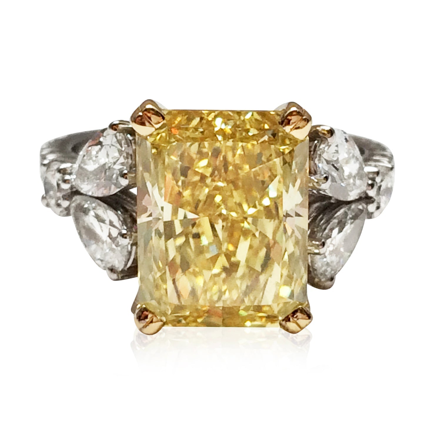
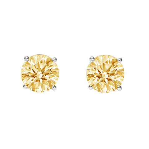
Discussing the Pantone Colours of the Year with special regards to the amazing pieces of Augustine Jewels.
Do we find ourselves wondering about the Pantone colour of the year?
Well, maybe.
In particular, if we are interested in trends in fashion, architecture, marketing or other aesthetically inclined areas, Pantone colours of the year might just be of particular importance to us.
But why, one might ask, should anyone follow a colour set by a particular institution? Why should we not trust and follow our intuitions or aesthetic sensibilities in deciding on the colour schemes for our designs instead of going for the choice of a body that has nothing to do with our own brand?
The answer lies in the communal spirit of design: when looking at design choices, people tend to appreciate relevance and a sense of dynamism, a sense of belonging. By having a colour scheme for the year, brands and designers can connect their work with one another and channel vitality, relevance and freshness as well as a sense of community. Keeping up to date with the colour of the year, therefore, is of special importance for any brand that wants to appear as ‘hearing the voice of times’. Knowing this, it is no longer mysterious why so many creatives wait eagerly for the 1st of December when Pantone colours get announced for the coming year: the day determines the style in which they will be working for the year to come.
Only one question remains: why is it that people rely on the colours chosen by one particular institute called the Pantone Color Institute? The answer is simply that the Institute has been the leading authority on colour for the past 60 years – or since complicated colour-matching became a major problem in the print industry. Creatives of all walks of life turn to the colour schemes and catalogues designed by Institute. And there is real expertise behind the colour schemes: the Institute has been matching colours and designing colour palettes relying on science, psychology, design history and aesthetics. This is what makes them a trusted source of advice on colours since 1963.
Today, however, it is the colour of the year that the Institute is most famous for. In 2000, the Pantone Color Institute created the 'Pantone Color of the Year' as a trendsetting concept for creative society as a whole that helps creatives create a strong global colour presence. The trend has taken off, and beauty lines around the word have been coming up with series of merchandise every year to reflect the colour trends.
The colours of the year announced appear to be rather omniscient, too. Classic blue, the Pantone Colour of the Year 2020 is said by Laurie Pressman, the vice president of the Institute, to anticipate what was going to happen in virtue of its somber tonality and darkness. Others are not so impressed by the choice, however, arguing that the calm of the colour fails to reflect the anxiety and confusion of the era that came upon the world in 2020.
Be it as it may, it is now time to focus on the Pantone colours of the year 2021. It is, for the second time in the history of Pantone colours, not a single shade but rather a couple: Ultimate Gray and Illuminating, an "optimistic" hue of yellow.
The Pantone Institute believes that the pairing of shades will help people "fortify themselves with energy, clarity and hope" in a world that's set to face increasing uncertainty.
The bright yellow shade, called Illuminating, is meant to evoke the "optimistic promise of a sunshine-filled day", while Ultimate Gray is a much quieter hue that speaks more of "composure, steadiness and resilience". Pantone says the colour can almost be compared to durable natural elements, like time-weathered pebbles on a beach.
"The selection of two independent colours highlight how different elements come together to express a message of strength and hopefulness that is both enduring and uplifting," explained Leatrice Eiseman, executive director of the Pantone Color Institute.
"Practical and rock-solid but at the same time warming and optimistic, this is a colour combination that gives us resilience and hope," she continued. "We need to feel encouraged and uplifted; this is essential to the human spirit."
‘Encouraged and uplifted’ – we could all do with that. Luckily, there is something readily available to lift our mood just like that. Something that can be on us at all times. You guessed it: it is jewellery. At our luxury jewellery studio in London, we make exquisite, hand-made collection pieces as well as bespoke jewellery that reflects the individuality of each of our clients.
Reflecting the Pantone colours of the year 2021, we recommend to you the following selection of stunning pieces:
Do follow us on social media @augustinejewels to keep up to date with our latest collection and bespoke handmade jewellery pieces and fashion recommendations!
Our Notting Hill flagship store is open Monday to Saturday from 10am to 5pm, at 75 Westbourne Park Road, London, W2 5QH.
For bespoke enquiries, please contact Alexandra directly at alexandra@augustinejewels.com.
For general enquiries, email info@augustinejewels.com or call 020 3556 5780 during business hours to speak to a member of our team.


